How Apple’s new IPhone 5S bald-faced copied Microsoft Windows Phone
 There
is no shame in copying excellence. In fact, I would say that a core
tenet of excellence is its ability to inspire excellence in others.
Microsoft had the first smartphone, that doesn’t diminish Apple.
Microsoft had the first smart watch, that doesn’t diminish Google.
Microsoft had the first DVR, that doesn’t diminish Tivo. You see,
standing on other’s shoulders (not their necks) is a harmonious
succession of advancements and innovations in the marketplace. Long live
compound innovations.
There
is no shame in copying excellence. In fact, I would say that a core
tenet of excellence is its ability to inspire excellence in others.
Microsoft had the first smartphone, that doesn’t diminish Apple.
Microsoft had the first smart watch, that doesn’t diminish Google.
Microsoft had the first DVR, that doesn’t diminish Tivo. You see,
standing on other’s shoulders (not their necks) is a harmonious
succession of advancements and innovations in the marketplace. Long live
compound innovations.Am I the only one thinking it? If Microsoft was the first, why does everyone else get credit? The reason is clear and irrefutable. History rewards the successful. Creators may innovate an idea (say, a GUI and a mouse) but whoever brings it to market successfully receives that historical reward. Of course, nobody would believe Microsoft invented the smartphone; like, nobody would believe Microsoft didn’t invent Windows – clear and irrefutable. Sort of.
 Let’s start this out on the right foot. Is “bald-faced” a loaded word? I think what I meant was “seemingly”. :)
 There is an abundance of excellence in the Apple, Android, and Windows Phone products. Excellence in engineering comes from people, and each of them employs people. Excellence in design comes from people, and each of them employs people. No single person “owns” innovation. Concurrently, no single company does either.
I believe when companies fight to be the most innovative, consumers win.Having said that, today was the reveal of Apple’s IPhone 5S. A truly beautiful offering. Not one that I plan to invest in, but one I can appreciate. As I admired it, I suddenly realized why I liked it. Imitation is the best form of flattery. And, the new IPhone 5S (and IOS7) has some particularly flattering features – especially when you consider them next to a Microsoft Windows Phone.
1. Metro
Yes, I said it. “Metro” was the previous name of the Microsoft Design Language. We now refer to it as the Microsoft Design Language. Not quite as catchy, but it means the same thing. The Microsoft Design Language is a clean, minimal approach with a Bauhaus influence. As a result, Microsoft’s new user interfaces on Windows, Windows Phone, and Xbox are all beautifully uncluttered.Here’s what IOS7 looks like:

Following Google, Apple has “adopted” a near-copy of Microsoft’s Design Language. The Apple version of the san-serif, Segoe UI font is startlingly identical, as it should be – Segoe is a beautiful and easy-to-read font. The incessant introduction of white space and reduction of chrome creates a breathtakingly nice IOS interface – one that would feel right at home on any Microsoft platform.
Here’s what Windows Phone has always looked like:

Interestingly similar, eh?
2. Scheuomorphism
One of the core Microsoft Design Language principles is to be “Authentically Digital” which removes physical affordances from a digital UI and embraces every pixel on the screen. This typically means that notepaper, spiral binders, scotch tape, leather, and other “physical” metaphors are avoided.
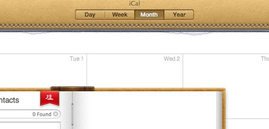
Not so long ago, Apple’s iCal (their standard calendar application) was the poster child for physical metaphors. To me, to be honest, I think it was very nice looking. But insofar as the overall ecosystem, it led a wave of real-life-looking (or skeuomorphic) apps that cluttered Apple’s canvas.
This is Apple’s new, flat iCal:

This is Microsoft’s idea of a calendar app:

Since we’re on the topic, we might as well point out that our friends, Google, are also into it:

Notice any similarities? It’s like one of those games my kids get at restaurants where there are two pictures and you have to circle the differences. You might start by circling the logo on the app. But, you might start running out of differences after that. It’s crazy.
In IOS7, the IPhone 5 has a similar minimalistic calendar:

The key characteristic is the lack of physical reference. The calendar is just the beginning, this is now a consistent and recurring theme throughout IOS. Clean. Minimal. White space. It’s all very nice. Quite beautiful and usable, really. But, of course, Windows Phone has always looked like that:

Interestingly similar, eh?
3. Colors
Nobody would question the immeasurable value Microsoft has received from its partnership with Nokia. And what do Europeans bring to the table more than anyone? Crazy colors. And, when Nokia first introduced the many colors for the Lumia, I about died. And then, of course, I got one.The reality is, bold and dramatic colors are also part of the Microsoft Design Language. Like scheuomorphism, embracing the digital medium means you are not bound to real world, common everyday colors. Pink, Yellow, and Blues are easily leveraged because they don’t need to “fit” into user expectations. As a result, your UI can be distinctive and bold.
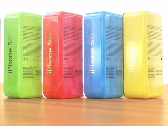
Here’s the IPhone 5C color options:

Beautiful, aren’t they? To be honest, to me, they are a bit muted for my taste. Even still, it’s a big departure from Black. Apple has embraced the very concepts delineated in the Microsoft Design Language – the idea that color can be a differentiator and a powerful source of user pleasure.
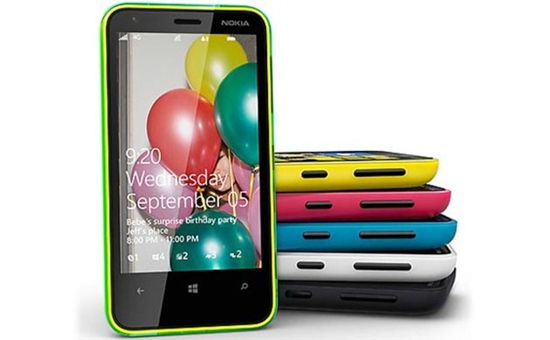
Here’s Nokia’s Lumia colors:

Interestingly similar, eh?
Conclusion

Here’s another article talking about similarities.The only conclusion we can draw is that designers have discovered a strong trend that is popular in the marketplace. I’m not trying to pretend that Microsoft invented minimal design, or colors for that matter. I’m just showing an industry trend toward parallel products. If I were to write an article on features in Windows Phone that first appeared on the IPhone, it would not be a short one. That doesn’t mean either platform is not immensely innovative, or that their engineers aren’t working miracles with every release. But, it does mean that these are the glory years for consumers. Long live competition.
Best of luck!
Sign up here with your email
ConversionConversion EmoticonEmoticon